-
United Kingdom+44 (20) 4577-20-00
-
USA+1 (929) 431-18-18
-
Israel+972 (55) 507-70-81
-
Brazil+55 (61) 3772-18-88
-
Canada+1 (416) 850-13-33
-
Czech Republic+420 (736) 353-668
-
Estonia+372 (53) 683-380
-
Greece+30 (800) 000-02-04
-
Ireland+353 (1) 699-43-88
-
Iceland+354 (53) 952-99
-
Lithuania+370 (700) 660-08
-
Netherlands+31 (970) 1027-77-87
-
Portugal+351 (800) 180-09-04
-
Romania+40 (376) 300-641
-
Sweden+46 (79) 008-11-99
-
Slovakia+421 (2) 333-004-23
-
Switzerland+41 (22) 508-77-76
-
Moldova+373 (699) 33-1-22
 English
Choosing the best font for programming
- Main
- Knowledge base
- Choosing the best font for programming
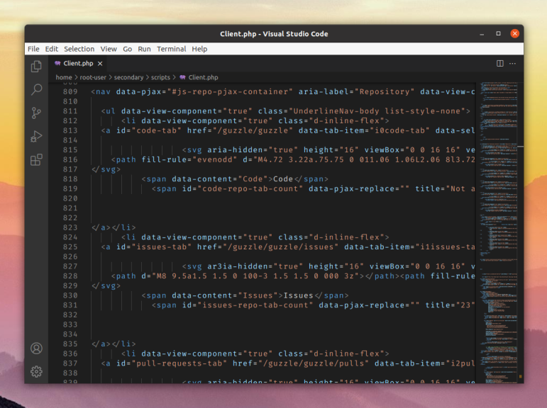
During programming you have to spend a long time at the computer and read program code. That's why choosing the right font is an important task. Comfort for the eyes is in the first place in this aspect. But visual style should not be overlooked either. In this review, let's look at what a good font for working with code should look like. We will show you the best fonts for programming, as well as provide instructions on how to download them.
Best Fonts
One of the most important metrics while choosing a font to work with code is readability. It is important that the characters are clearly legible. Have a simple shape in a uniform style. Otherwise, the eyes will get tired quickly. Often ligatures are used in them. These are signs that consist of several symbols that merge with each other. Due to this approach, reading becomes more comfortable. But it is still possible to simplify the programmer's work with program code more effectively. So we have selected eight different fonts. Each of them has its own distinctive features.
JETBRAINS MONO
A free font intended for developers. The emphasis in it is made on comfort when reading and editing code. All symbols have a similar simple shape. They have the same width and there are no elements on the outer borders, for example, the same serifs. This is especially convenient when reading vertically.

Main features:
- lowercase letters are purposely made taller.
- All characters have a unique appearance, for example, the number 0 has a dot inside, while in the case of the letter O it is absent.
- presence of ligatures.
- Italics has a non-standard angle of 9 degrees.
The latest version of the font is available for download from the official website.
FIRA CODE
Fira Code is a subspecies of the monospaced Fira Mono. It is distinguished by identical lettering of all characters, but there is one difference - the use of ligatures, which are only in Fira Code. The font was originally created for Firefox OS. The designer emphasized on better readability.

To download the font, you should go to the official repository. To do this, run the command:
$ sudo apt install fonts-firacodeAfter it is finished, Fire Code will appear in the system. But if the command does not work, then useGoogle Fontsto download it.
MONOLISA
The next monospaced font, conceived especially for software developers. In addition to excellent readability, the creators paid special attention to the visual style. Characters have an increased width, and in height may vary slightly. There are 120 ligatures specifically for program code. The characters themselves have a choice of alternative styles.

This font is distributed on a paid basis on the official website. It has a trial version only for Latin, without ligatures and other features. It is suitable for non-commercial use only.
IBM PLEX MONO
The idea behind IBM Plex Mono is to show IBM's spirit and ideology through its history. In its style, it is a grotesque font that is perfectly readable on all devices. All of the above combined with monospacedness makes it optimal for working with code.

You can always find a new version of IBM Plex Mono in the official repository on Github. Download one of the font versions, such as the more modern TrueType.zip. Open the IBM-Plex-Mono folder in the resulting archive and then extract it to your system.
SOURCE CODE PRO
From the font's name alone, it is clear that this font was originally designed for both reading and editing source code. Source Sans is used as the base.

The features of the font are:
- increased height and width of the characters, but between each other they are reduced to the same size.
- characters are not similar to each other, which is especially important, for example, with i, l and 1.
- the sizes of punctuation marks have been increased.
- availability of the Adobe Latin 4 glyph set.
It also supports many languages, but it mostly uses Latin.
MONOID

Monoid by its appearance is made in pixel style. The font is perfect for screens with low resolution. The characters themselves are perfectly distinguishable and have large apertures (vertical and horizontal slices on the borders). Special attention in it is paid to customization, because many parameters can be configured even before downloading. Monoid is available for download at its creator's website, Larsenwork.com.
UBUNTU MONO
The font was originally conceived for Ubuntu and is embedded in this Linux distribution. It has no serifs, which is important when learning code. Ubuntu Mono uses OpenType features and is perfectly distinguishable even on small screens, such as on mobile devices.

Ubuntu Mono font is publicly available on the official website. Scroll down this page to the Resources section and click Download for Free to download it. You can also find it on Google Fonts. To download it, open this link and click on Download Family.
INCONSOLATA
The monospaced Inconsolata is inspired by the proportional font Avenir, the proprietary Consolas and Letter Gothic, a classic font for IMB computers. It originally lacked boldface, but it was added over time. Among the features of the font is the high quality of the characters in output. This is one of the aspects that its creator emphasized on.

The fastest simple option to download Inconsolata is to use the official Ubuntu repository. The following command is responsible for this action:
$ sudo apt-get install fonts-inconsolataWell, if an error occurs when executing it, then download the font from the Google website in the usual way.


